Last summer, I taught the MAET Year 2 Summer Cohort with Danah Henriksen. After teaching the class, Danah realized she had taught five cohorts of (awesome) students and that we had some information available from pre- and post-course self-reported surveys to understand how students grew in terms of their confidence in using different educational (and other) technologies.
That research idea evolved into a study with Rohit Mehta that involved, among other findings, a visualization of average pre-post values for specific technologies. Over back-and-forth emails, Rohit and I shaped the figure up into what we think is a good representation, using the ggplot2 R package.
We realized our back-and-forth in terms of our revisions was possibly interesting to the extent that it showed us that there isn’t often one right way to create a figure using, but playing around and revising one can help.
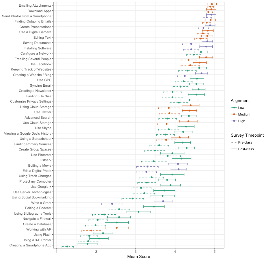
Also, we thought the findings were interesting! Alignment represents how much of a focus the particular technology was over the course of the three summer classes; students seemed to grow, even in technologies that were not the focus of or aligned with the activities in the classes.
We were generating these interactively and did not think to save or commit earlier versions; but the code for the final version (version 5, below) is (in a not very edited form) here.
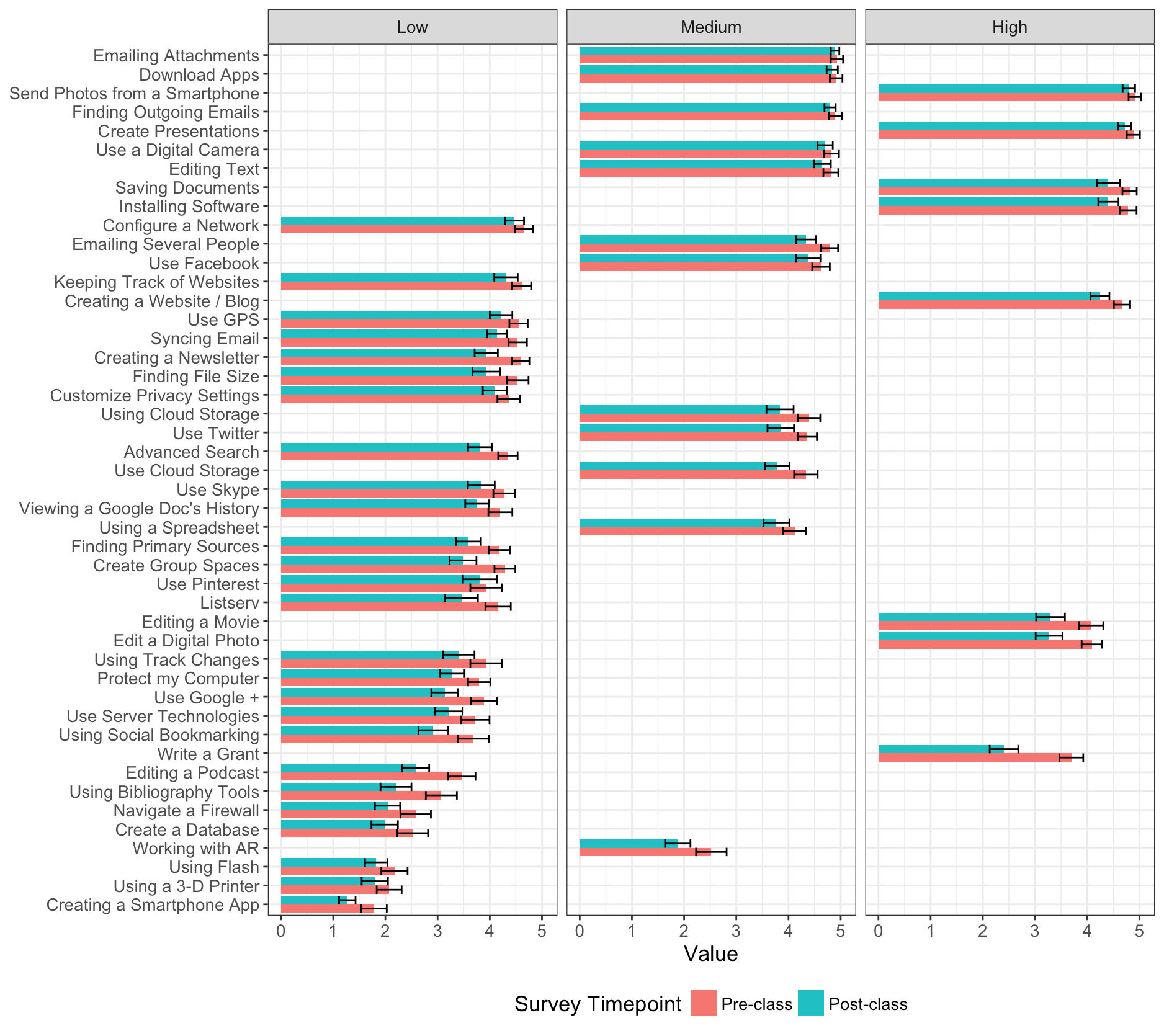
Version 1: Bar chart with three “facets””
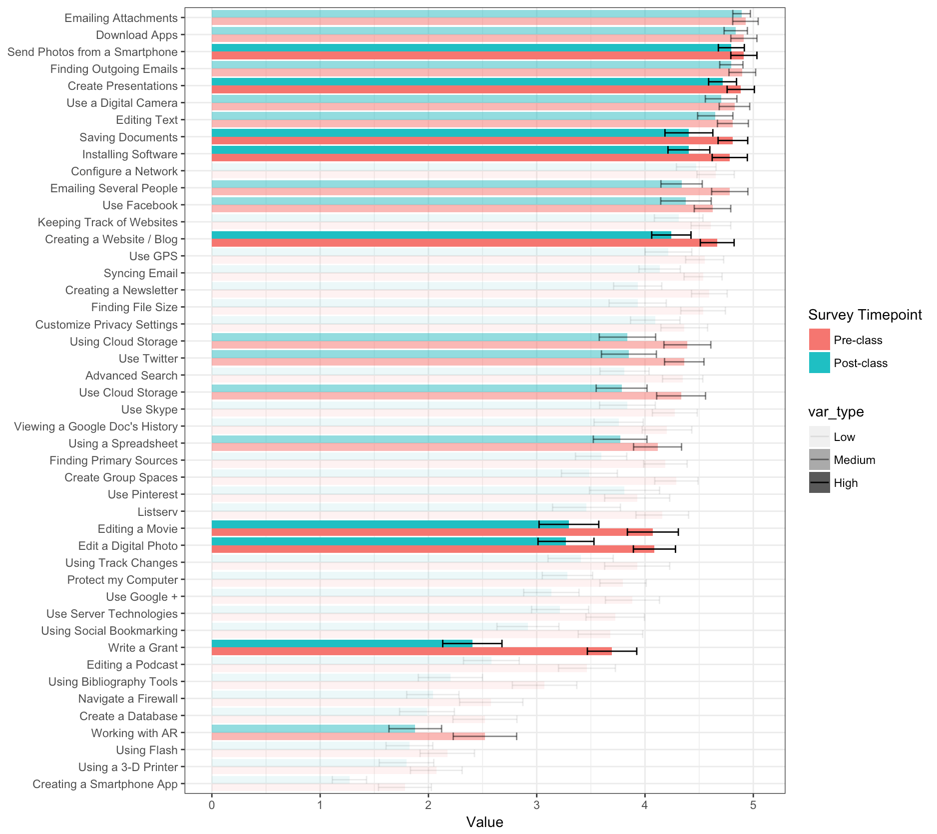
Version 2: Bar chart with different shading for different alignment
Version 3: Use of points instead of bars with different alignment
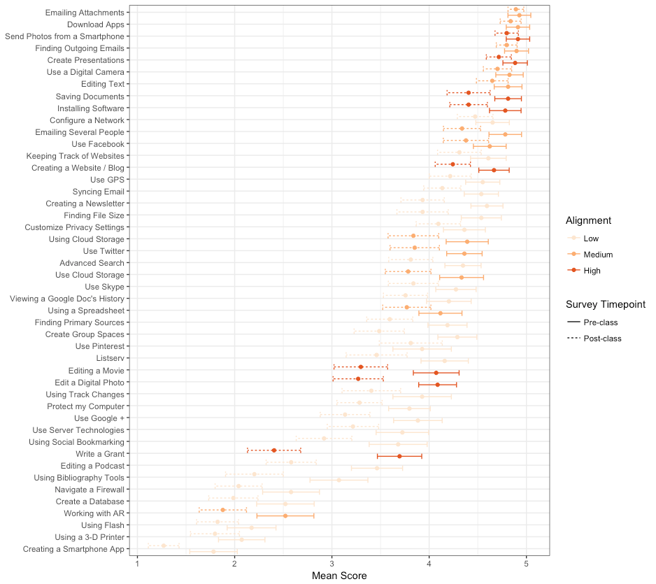
Version 4: Use of points instead of bars with different alignment
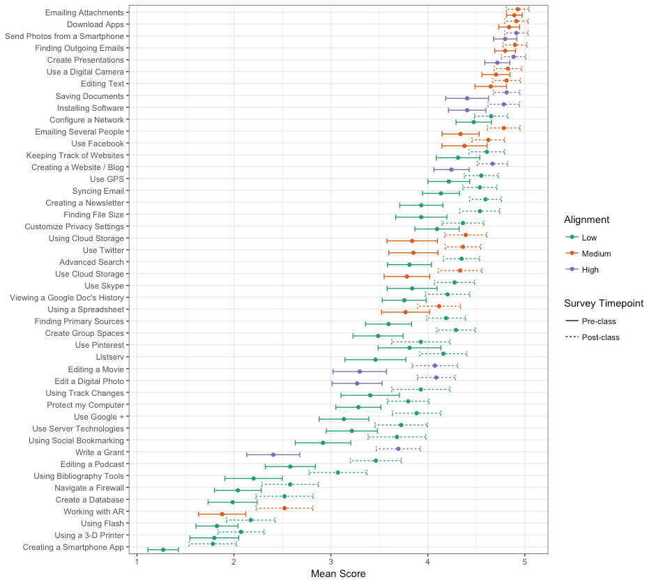
Version 5: Use of points instead of bars with different alignment and pre-survey bars dashed (instead of post-survey bars)