DSET
A few weeks ago, I was fortunate to attend the Data Science Educational Technology (DSET) conference.
The goal for the conference was to kickstart data science education and to explore an educational technology, Concord Consortium’s Common Online Data Analysis Platform. What’s the big idea about data science education? To me, it’s a recognition that data is power, and that through asking questions, collecting and creating data, analyzing and modeling data, and making sense of and communicating what is going on can be empowering to learners. Digital technologies, from tools to new data sources, can be a key part of these processes.
It was a good experience and thankful to have had the opportunity to learn from the awesome teachers, researchers, and developers in attendance and to have a (very tiny!) voice in the conversation).
Some highlights
- Welcome talk on “what smells like data science education” (it seems to have something to do with recognizing computation as something important to analysis, using data for purpose(s) beyond those for which they were originally created, and acting on intuition about a topic or problem - but I’m very humble about trying to summarize these!)
- Listening to demonstrations of CODAP, tools built-in to CODAP (like SageModeler), and stand-alone tools and other examplars
- Learning how to adapt a Data Interactive (in Javascript and HTML)
- Learning how to integrate NetLogo simulations in CODAP
- Discussion of simulations and modeling in online classes
- Take’s presentation on turning data into sounds
- Discussing what (future) technologies might be needed and how to make it easier for students to access data
A look at #dsetonline
I collected the tweets for #dsetonline using TAGS (in Google Sheets). Does this “smell like data science” (I don’t quite think so, but that’s okay)?
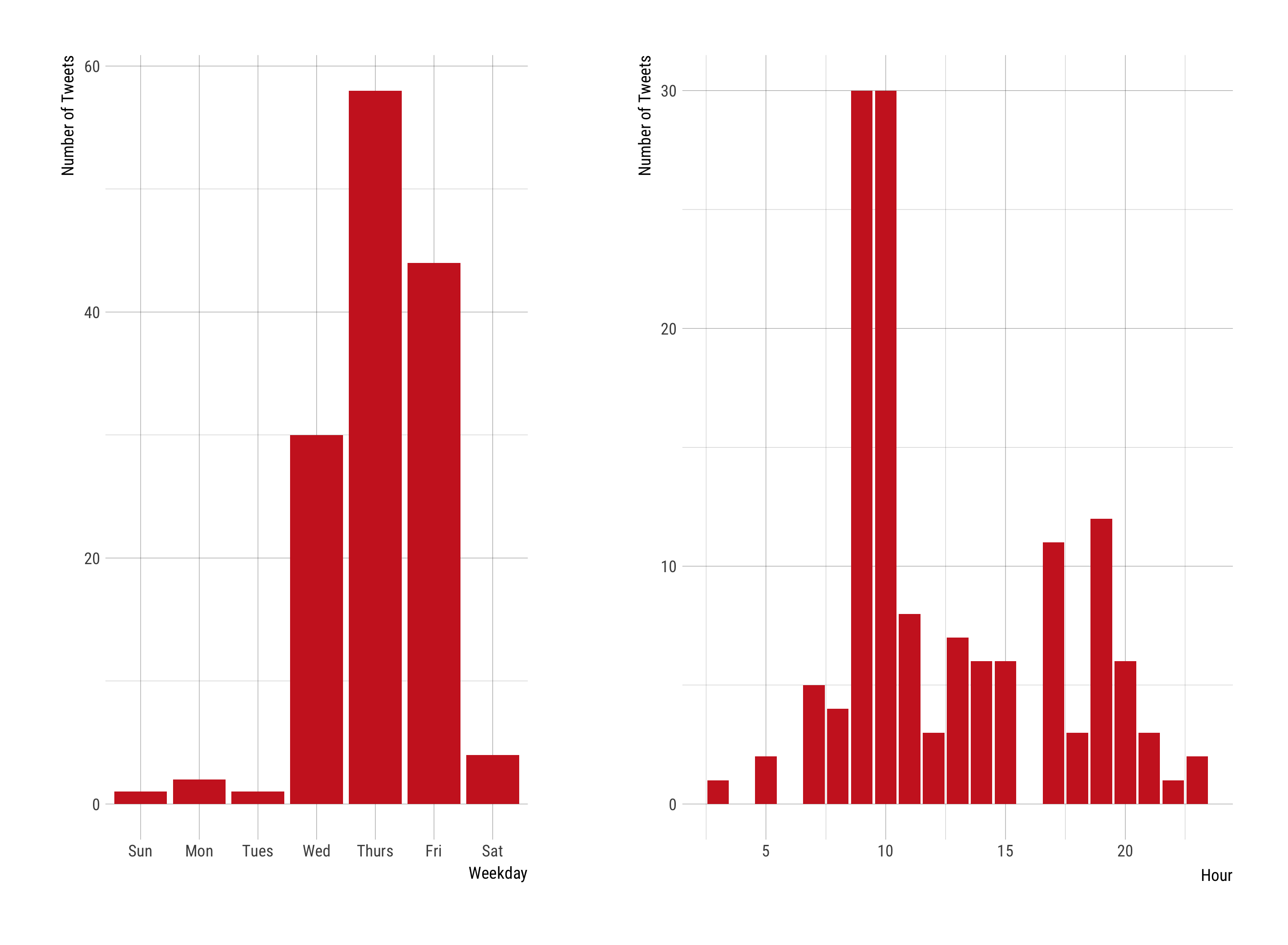
Here is a look at when #dsetonline was used:
Here is a sociogram, or visualization of the network structure, showing relationships between participants:
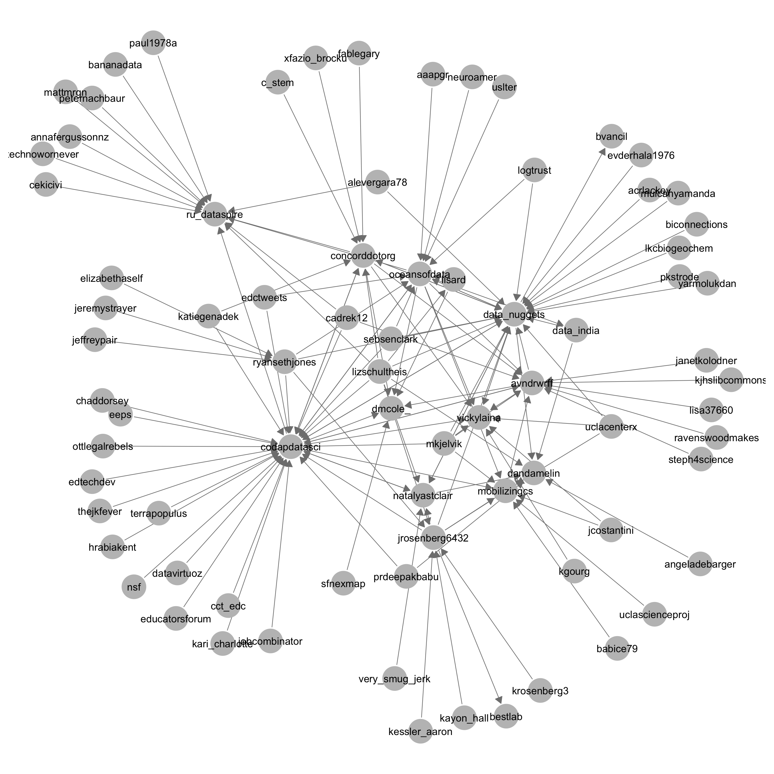
In this figure, an arrow is directed from one participant to another if one participant a) mentioned, b) replied to, c) retweeted, or d) like the tweet of the other participant.
The Twitter accounts for CODAP and Concord Consortium were both prominent, as were accounts for the organizers and many of the participants at conference. There were also connections to organizations not at the conference, which is interesting because it shows some of the groups learning about and supporting data science education, an educational idea I think is worth recognizing and supporting.
The data (and a file for the analysis) is here.
**EDIT: I wrote this post before I used blogdown. In addition to above, the code is here:
library(tidyverse)
library(lubridate)
library(GGally)
library(igraph)
library(hrbrthemes)
library(cowplot)

df <- read_csv("tweets.csv")

df$date <- parse_date_time(df$date, "%a %b! %d! %H! %M! %S! %z! %y!")
df$date <- with_tz(df$date, "America/Los_Angeles")
df$wday <- wday(df$date, label = T)
df$hour <- hour(df$date)

p1 <- df %>%
    count(wday) %>%
    ggplot(aes(x = wday, y = n)) +
    geom_col() +
    theme_ipsum_rc() +
    xlab("Weekday") +
    ylab("Number of Tweets")

p2 <- df %>%
    count(hour) %>%
    ggplot(aes(x = hour, y = n)) +
    geom_col() +
    theme_ipsum_rc() +
    xlab("Hour") +
    ylab("Number of Tweets") +

cowplot::plot_grid(p1, p2)

ggsave("dset_time.png")

create_the_edgelist <- function(df, sender_col, receiver_col){

    df_ss <- filter(df, type == "ORIG" | type == "REPLY")

    receiver <- select_(df_ss, receiver_col)
    receiver <- collect(select_(receiver, receiver_col))[[1]]

    df_for_sender <- select_(df_ss, sender_col)
    df_for_sender <- collect(select_(df_for_sender, sender_col))[[1]]

    sender <- stringr::str_split(df_for_sender, "\\*")

    tmp = stack(setNames(sender, receiver))[, 2:1]
    names(tmp) <- c("receiver", "sender")

    tmp$sender <- tolower(tmp$sender)
    tmp$receiver <- tolower(tmp$receiver)

    tmp <- tmp %>% dplyr::mutate(var = sender_col)
    # tmp <- filter(tmp, !is.na(sender))
    tmp <- tbl_df(tmp)

    return(tmp)
}

favorites <- create_the_edgelist(df, "favNames", "screen_name")
mentions <- create_the_edgelist(df, "non_reply_mentions", "screen_name")
retweets <- create_the_edgelist(df, "rtNames", "screen_name")
replies <- create_the_edgelist(df, "reply_user_sn", "screen_name")

all_df <- bind_rows(favorites, mentions, retweets, replies)

all_df$var <- ifelse(all_df$var == "favNames", "Favorites",
                     ifelse(all_df$var == "non_reply_mentions", "Mentions",
                            ifelse(all_df$var == "rtNames", "Retweets",
                                   ifelse(all_df$var == "reply_user_sn", "Replies", NA))))

# Plot

all_df$receiver <- tolower(all_df$receiver)
all_df$sender <- tolower(all_df$sender)
all_df_ss <- select(all_df, sender, receiver)
all_df_ss <- all_df_ss[complete.cases(all_df_ss), ]
g <- igraph::graph_from_data_frame(all_df_ss, directed = T)
g <- igraph::set_edge_attr(g, "weight", value = 1)

g <- igraph::simplify(g, remove.multiple = T, remove.loops = T, edge.attr.comb = list(weight = "sum"))
E(g)$weight <- sqrt(E(g)$weight) * .85

g_p <- intergraph::asNetwork(g)

GGally::ggnet2(g,
               label = T,
               # size = "degree",
               # edge.size = "weight",
               arrow.gap = 0.02,
               arrow.size = 6,
               palette = 2,
               label.size = 3
               ) + theme(element_text )
If you take a look, you will notice the data used for the analysis was the TAGS data lightly processed with an additional script (send me a message if you want to learn more about it).